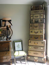
You've heard the decorating tip that when you group objects together you should group in odd numbers because it's more pleasing to the eye. But, do you know the importance of the triangle in design? I read this tip years ago and it has proved to be very helpful. When I put together a vignette and stand back to admire my work, if something looks just a little off, I use the triangle rule. Does my design form a triangle? Does it have the proper height and balance? Usually if I rearrange things, keeping this rule in mind, it makes the difference between "just okay" and "just right!"
So next time your display doesn't quite have the WOW factor that you're looking for, remember the power of the triangle. And if you recall those days from high school algebra, you know that all triangles are not created equal. The beauty of this rule is that your design can form an equilateral, isosceles, right(or left) triangle and it works. You can even layer your triangles for more flare. It's all about height and balance.
AAAHHH! Triangle Power!


2 comments:
I LOVE TRIANGLES! Thanks for teaching me something new about my favorite shape!
Thanks for the tip. I think that will help as I continue to decorate my house. I'm often stuck or unsure of how to lay things out to make it "just right". Congrats on making it into Today's Creative Blog!!!
Post a Comment